BRINGING A WHITE PAPER TO LIFE:
Soli is a new technology that uses a miniature radar chip to utilize touch-less micro-gesture interactions. In 2015 I was tasked with helping the Soli team at Google's Advance Technologies and Projects group to design their first marketing website to be launched in tandem with their major announcement at I/O '15.
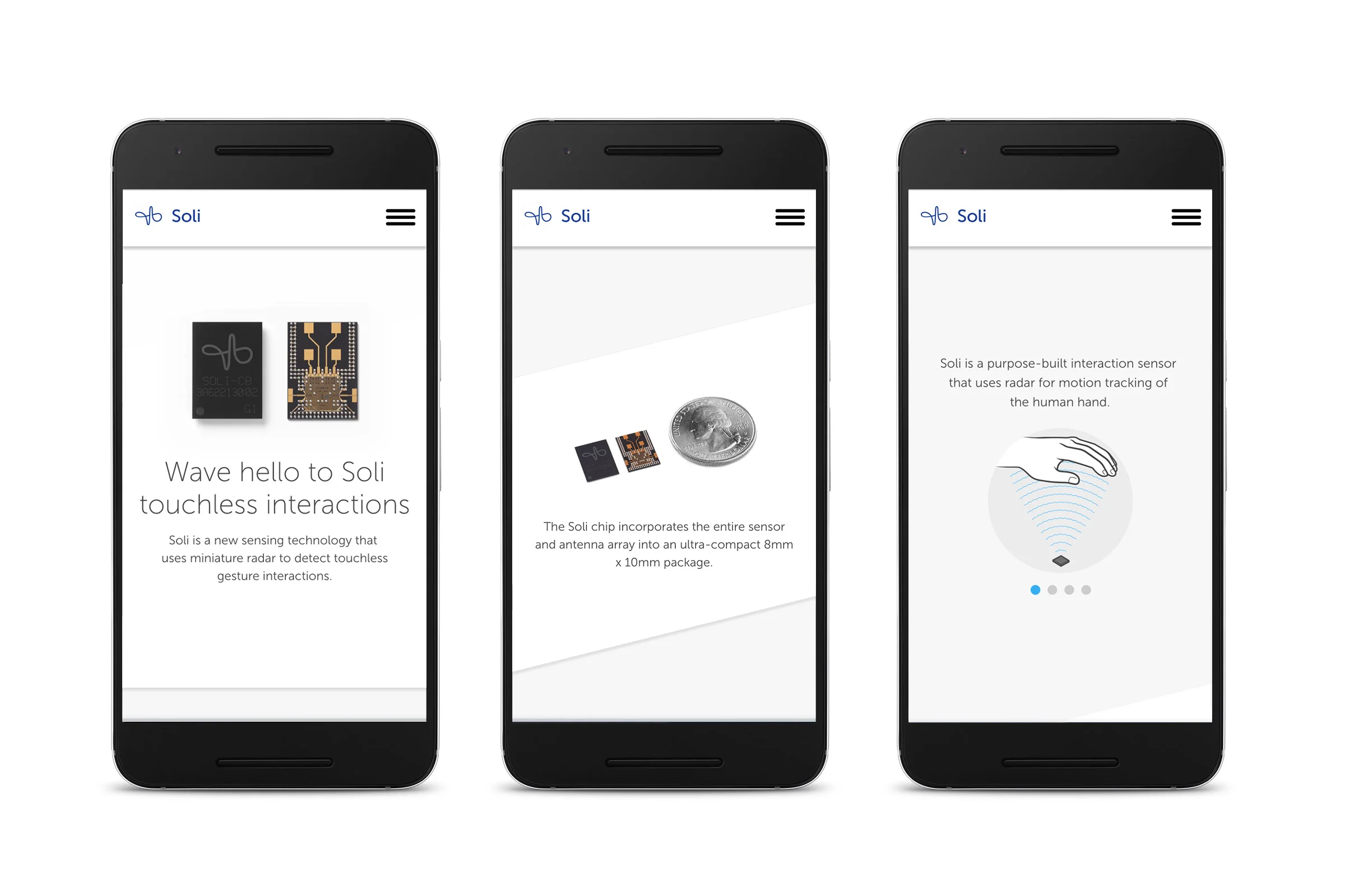
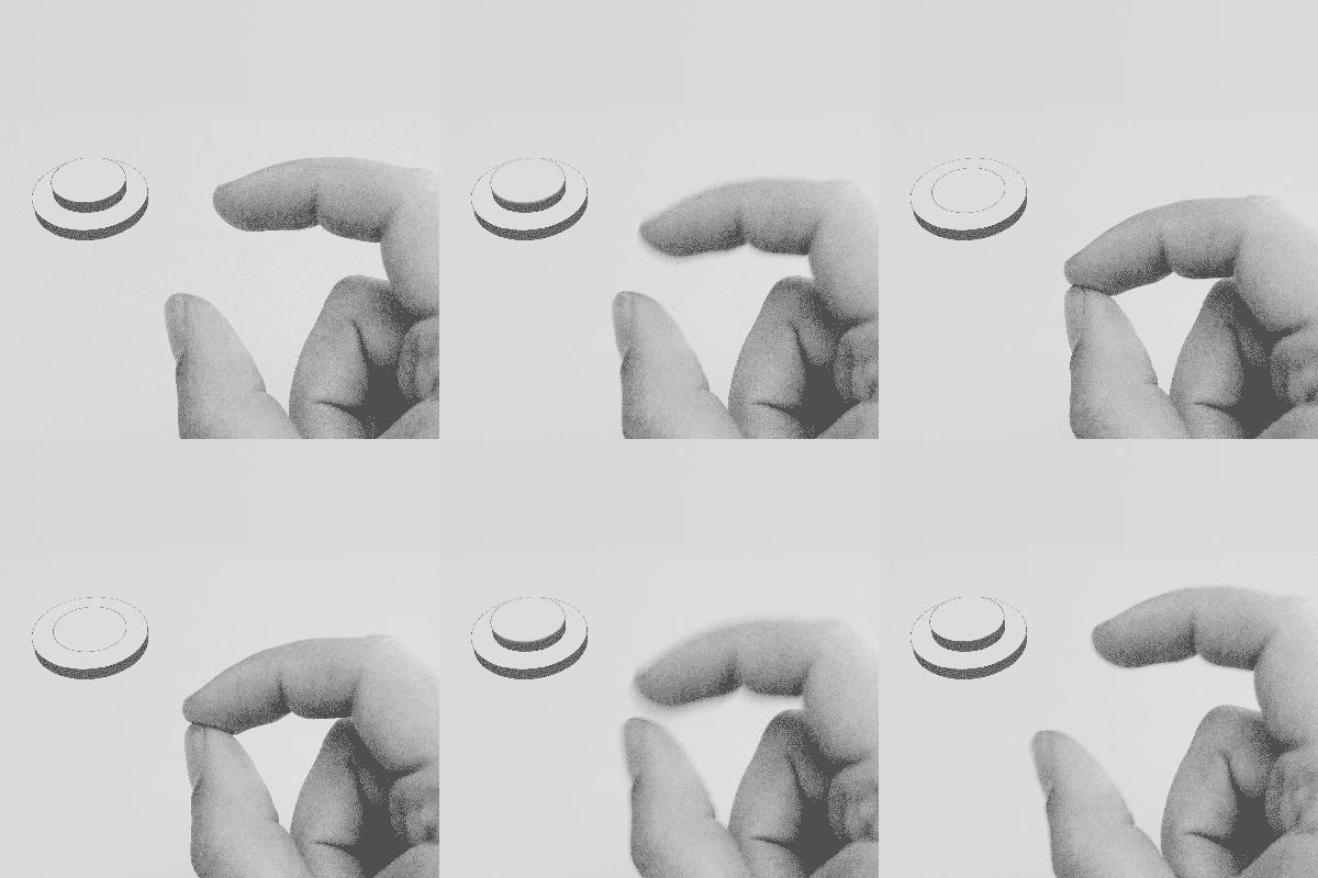
The Challenge: How do we explain a completely new interaction paradigm in a mobile-first design approach? Web video, with it's need to do a full-screen takeover, was out of the question on even the most advanced mobile browsers at the time. Ironically, it was in revisiting the "older" technology of GIF's that we were best able to show quickly and easily what Soli could do without requiring users to be locked into one video at a time.
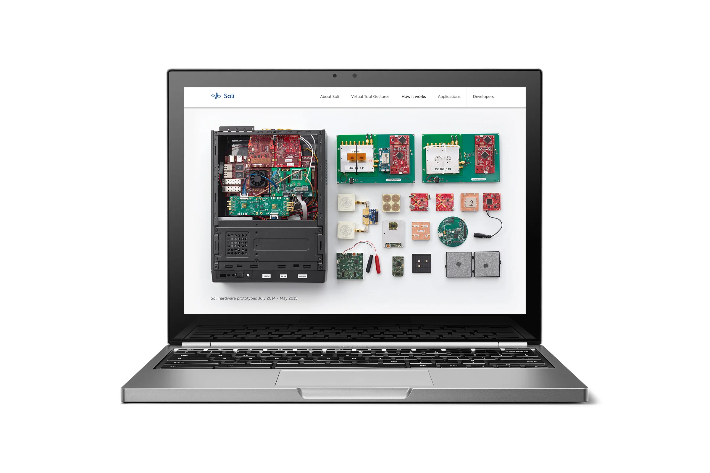
I lead all aspects of design on the site, from defining the IA and user flow, UX wireframes, visual design, gif production and interaction animations and oversaw the asset hand-off to the developers. I also authored the copy for major headlines (I'm very proud of "Your hands are the only interface you'll need") and wrote much of the first drafts of the body copy, re-interpreting the wordy white paper documentation into more easily understandable marketing language in collaboration with technical experts within the Soli team. This removed the need for an external copywriter, and allowed the typographic composition and copy content to work synergistically. We ended saving the typical back-and-forth time massaging body copy, which proved to be of utmost importance in our race to finish and get approval before I/O '15.
In 2017, the website is still up and almost entirely unchanged even with all the traction it's received. I consider this relative longevity a major victory for a brand that tends to re-vamp their marketing websites up to several times a year depending on user metrics. I attribute this design durability to approaching this project with quite a light handed approach, allowing the visual content and it's tight correlation with the written copy to be the hero of the experience instead of relying on heavy handed frills to delight and distract users. Like they say, less is more.
Fun fact: this website is considered by many to be the first Google property to use "diagonal" backgrounds for content areas. This part of the design was one of the most controversial among brand guardians at the time. I had to defend it's existence by showing it encourages downwards exploration over traditional rectangular dividers. Diagonal content blocks are now seen in the backgrounds of Android.com, Google Devices, and many other newer Google properties launched in the past year. I by no means claim to have invented the diagonal background block's usage on the web, but it was incredibly hard to get this design greenlit through a brand built on the white, rectangular box at the time.
Visit the live site here.


